Image courtesy of TCGdex.net
Color palette choices and visual tone in Pokémon TCG
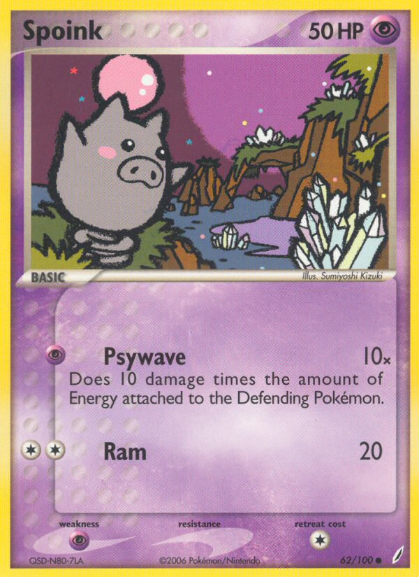
Color is more than decoration in the Pokémon TCG; it’s a language that signals type, playspace, and mood. When you look at a Spoink card—an adorable Basic Psychic Pokémon with a bubble-like pink body—you’re not just seeing a creature strut across a battle mat. You’re witnessing a deliberate palette choice that sets expectations for how the card will feel in play and how collectors will connect with it. The pinks, violets, and high-contrast edges tell a story of whimsy and focus, inviting players to lean into strategy while fans smile at the character’s charm. ⚡💎
Spoink’s pink heartbeat: how the palette aligns with Psychic energy
In the Crystal Guardians set, Spoink bears a soft pink that leans toward lavender in print, a choice that makes the Psychic type feel approachable rather than ominous. This palette isn’t accidental: Psychic energies in the TCG are often represented through purples, teals, and cool pink accents that suggest unseen force rather than brute force. Spoink’s HP sits at a modest 50, a reminder that in a game built on timing, positioning, and energy efficiency, the card’s aesthetic lean-in signals a gentler, reactive playstyle. The two attacks—Psywave and Ram—use color cues to guide your expectations: Psywave’s psychic cost aligns with the purple hue family, while Ram’s Colorless energy feels like a neutral push, reflected in the card’s soft edge-work and clean typeline. The overall tone feels friendly but tactical, inviting players to experiment with energy placement while appreciating the card’s charm. 🔮
Artistry that speaks: Sumiyoshi Kizuki’s touch on Spoink
Sumiyoshi Kizuki’s illustration for Spoink on ex14-62 captures a buoyant moment—Spoink perched with an alert gaze, its round body rendered in a luminous pink that pops against a cooler, pale background. The color balance emphasizes clarity on the battlefield: the pinks don’t overwhelm the card’s legibility; instead, they anchor the Psychic identity while ensuring energy costs and attack names stay readable at a glance. This is crucial for quick deck-building decisions, where you might be juggling Psywave’s damage potential (10 times the attached Energy) or the straightforward Ram for 20 damage. The holo variant, while not always included in every print run, elevates the palette with a reflective shimmer that makes Spoink feel almost luminescent—an effect that collectors often seek when balancing aesthetics with playability. 🎨
From layout to life: how color guides gameplay perception
The card’s stage and rarity contribute to its visual rhythm on the table. As a Basic Pokémon, Spoink sits at the front in early turns, and its color palette helps players instantly identify it as a Psychic-type ally rather than a pure colorless attacker. The faint purple whispers around its silhouette encourage you to think about synergy with energy acceleration and Psychic-type strategies rather than merely raw speed. The card’s weakness—Psychic ×2—creates a color-coded caution: if your opponent stacks enough Psychic energy, Spoink’s vulnerability becomes a visible variable you must manage. This interplay between color and mechanics makes each decision feel intentional, turning even a modest 50 HP into a moment of strategic flavor. ⚡🔥
Collecting lens: rarity, holo variants, and market vibes
Spoink ex14-62 sits in the Common rarity tier, which means it’s a staple that often appears in multiple copies across decks and binders. The aesthetic variety—normal, reverse, and holo variants—adds a pleasing depth to color experiences. The holo treatment introduces extra sheen that can intensify the pink and purple tones, making the card feel like a collectible beacon on the shelf. For collectors, the palette dynamics can influence perceived value: holo variants tend to fetch higher prices and display more dramatic color shifts under light, while non-holo copies retain a broader accessibility. Market data shows that common Spoink cards tend to hover around modest prices, but holo or reverse-holo versions can rise in value as demand for Crystal Guardians’ pink-hailed Psychic cards grows. CardMarket shows average values around a few tenths of a euro for non-holo copies, with holo versions climbing into a couple of euros in some markets, while TCGPlayer reflects similar tiered dynamics with noticeable spikes for reverse holo foils. These pricing cues mirror the visual appeal of Spoink’s palette and remind collectors how color can be a driver of desirability as much as gameplay. 🧩
- CardMarket (non-holo common): avg around €0.22; low €0.02; 7-day trend about +€0.15; holo variants typically higher.
- CardMarket (holo): avg around €2.31; low €0.89; 7-day trend around +€2.75 for holo foil copies.
- TCGPlayer (normal): low around $0.10, mid around $0.31, high around $1.66; market price roughly $0.31.
- TCGPlayer (reverse holo): low around $3.00, mid around $7.07, high around $19.99; market price about $2.71 for typical listings.
- Visual appeal can tilt collectibility: holo and reverse-holo variants often command premium due to the interplay of pink hues with light reflection.
Palette as storytelling: how to showcase Spoink in a deck or display
When you design a deck around Spoink, you’re inviting a palette-driven narrative. Pair Spoink with other Psychic or color-mushroomed cards that lean into purples, teals, and cerulean accents to preserve a cohesive look on the battlefield. The soft pink aura of Spoink can be echoed by supportive Pokémon in the same color family or contrasted against darker, cooler tones to make its silhouette pop. On display, a well-lit glass case can catch the holo sheen and highlight the subtle gradient along Spoink’s body, turning a card into a small piece of art that tells a story about patience, bounce, and tactical planning. The illustrator’s work—Sumiyoshi Kizuki—remains a key selling point for fans who collect the artistry behind the color choices, not just the numbers on the card. 🎴
Product spotlight: a practical way to blend collection and everyday carry
While the color language of Spoink may live on the card, it extends into practical accessories that celebrate the TCG lifestyle. If you’re looking to protect and display your favorite Pokémon cards with style, consider the Neon Card Holder Phone Case with a glossy/matte finish. Its eye-catching palette and modern finish complement the pink-and-purple mood of Spoink, letting collectors carry their passion with a touch of neon flair. Whether you’re at a tournament table or a weekend display, this case is a playful nod to the visual vocabulary that makes the Pokémon TCG so enduringly appealing. Stay sharp, stay colorful ⚡💎
For fans who want a tangible piece of the color story beyond the card itself, the product is a perfect way to blend everyday practicality with trading-card passion. The design language echoes Spoink’s energy and the broader Psychic aesthetic, creating a cohesive experience from playmat to everyday carry.
Neon Card Holder Phone Case – Glossy Matte FinishMore from our network
- https://crypto-acolytes.xyz/blog/post/unveiling-mortal-kombat-the-saga-behind-the-tournament/
- https://crypto-acolytes.xyz/blog/post/minecraft-pillager-raids-top-tactics-for-safe-bases/
- https://blog.digital-vault.xyz/blog/post/g-band-brightness-reveals-a-distant-reddened-hot-giant/
- https://transparent-paper.shop/blog/post/the-art-of-blending-fabric-and-paper-textures/
- https://blog.digital-vault.xyz/blog/post/parallax-maps-distance-to-a-hot-blue-star-in-scorpius/