Image courtesy of TCGdex.net
A journey through Raichu’s card frames across Pokémon TCG eras
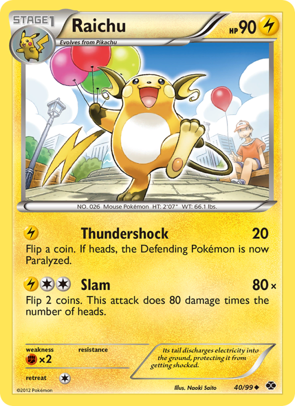
The evolution of a single Pokémon card’s frame is more than cosmetics—it’s a window into the evolving language of the Pokémon Trading Card Game. Raichu, the electric successor to Pikachu, serves as a stellar case study in how frame design has shifted to balance legibility, flavor, and value across generations. From the first splash of borders to modern holo-heavy presentations, each era reinterprets the same core data (name, HP, type, stage, attacks) in a way that signals a different era of play and collection. Today we zoom in on a standout example: Raichu from the Next Destinies set, BW4-40, a card that captures the mid-2010s shift toward sleeker, information-forward framing while honoring the beloved electric mouse’s evolving identity.
From the early borders to a cleaner, information-forward look
Early Pokémon TCG frames favored warm, textured borders and broad canvases that framed a portrait of the Pokémon with generous margins. The art often overwhelmed the card’s other information, including energy costs and attack details. As design sensibilities matured, the frame began to retreat, allowing the artwork to breathe while energy costs and abilities found more efficient spacing. Raichu’s journey through these changes mirrors the broader transition from “maximally decorative” to “maximally legible,” a shift that improved on-table readability for both new players and seasoned collectors. In the Next Destinies lineage, the frame leans toward a crisp, high-contrast look that foregrounds the illustration and the essential card data—the kind of layout that helps players quickly read a card during a heated match or a tense jam in a tournament setting.
Raichu in the Next Destinies era: a closer look at BW4-40
Raichu’sBW4-40 card is a Stage 1 Lightning-type Pokémon that evolves from Pikachu. It carries 90 HP and presents two distinct attacks that showcase how frame design interacts with gameplay:
- Thundershock — Cost: Lightning. For 20 damage, with a coin flip determining whether the Defending Pokémon is Paralyzed on a heads. The ability to convey a conditional effect succinctly relies on a compact text area near the bottom of the card, a design choice that the Next Destinies frame respects by keeping the effect readable without crowding the creature’s art.
- Slam — Cost: Lightning, Colorless, Colorless. This attack promises 80 damage multiplied by the number of heads from two coin flips. The frame’s balance of energy costs, damage, and the probabilistic wording is a nod to the era’s emphasis on probabilistic outcomes and strategic timing, all while maintaining clear visual separation between the attack name and its effect.
The card’s set, Next Destinies, marks a transitional moment in frame aesthetics. The label area, set symbol, and rarity marker are carefully positioned so that the hero artwork remains the star while the bottom band carries the essential information: HP, type, stage, retreat cost, weakness, and legal formats. Raichu’s illustration—credit to Naoki Saito—sits confidently at the top of the card, framed by a border that feels modern without losing the warmth of the Pokémon universe. The art’s gloss and the holo variant (noted in the card’s variants) highlight the continuing importance of visual drama in the collection, even as players crave cleaner gameplay readability.
Gameplay implications of the frame and Raichu’s moves
The frame’s tightened typography and structured sections help players parse key numbers quickly—HP, attack costs, damages, and weak points. For Raichu, the synergy between Thundershock and Slam creates a decision tree in play: Thundershock offers a reliable way to disrupt with a chance to Paralyze, while Slam brings big upside with multi-coin risk. The 1 Retreat cost, Lightning-type weakness to Fighting, and the card’s 90 HP position Raichu as a midrange option—not the tank or the tempo king, but one that can swing a game through careful energy management and timing. The frame design supports this strategic calculus by ensuring the attack text remains readable even as you flip coins and weigh risk versus damage in a crowded play space.
Illustrator Naoki Saito’s work on this card adds a tactile warmth that complements the electric motif, while the holo variant offers that coveted shimmer fans chase—without compromising the legibility of the attack descriptions on busy play sheets. The balancing act between aesthetic flair and practical information is a hallmark of the Next Destinies era, where players could appreciate a card’s beauty while relying on a clean data layout during a match.
Collectors’ perspective: value, rarity, and frame-driven desirability
Raichu is labeled as Uncommon in this set, a designation that matters in the collector’s market when framed against holo-versus-non-holo versions. Price data across modern markets show a spectrum reflective of condition, print run, and holo status. Cardmarket’s numbers suggest a broad range, from very low entry points to more comfortable mid-range values, with holo variants often commanding a premium. On TCGPlayer, normal copies show lower price points, while holo versions trend higher in market activity, with direct and market prices painting a picture of steady demand among players and collectors who appreciate the era’s signature frame language. These financial signals aren’t just about raw numbers—they reflect how the community values the design language of a specific era and how a card’s presentation contributes to its storytelling appeal on the shelf and in online galleries.
To fans and collectors, Raichu’s frame in Next Destinies represents more than a single card; it’s a bridge between Pikachu’s classic origin and the modern emphasis on cinematic holo effects and clean typography. The electric vibe of the artwork, paired with a frame that respects the card’s data, makes this Raichu a memorable piece in any Lightning-type lineup—and a reminder of how far the design language has evolved since the hobby’s early days.
Art, lore, and the enduring charm of the frame
Frames are one part function, one part character. The transition from ornate borders to streamlined panels mirrors the Pokémon world’s broader shift toward accessibility and clarity, while still letting artists like Naoki Saito leave a signature mark. Raichu’s Next Destinies presentation captures the moment when the game’s visuals started to emphasize energy symbolism and action lines that read well on camera, a boon for fans who photograph their collections for social sharing. The card’s energy costs, attack names, and effects—encased in a frame that respects negative space and contrast—contribute to a sense of rhythm and anticipation that’s essential to both casual play and tournament strategy. ⚡🔥
Whether you’re a veteran who remembers the older, warmer borders or a modern collector drawn to holo shine, Raichu’s frame provides a tangible link to Pokémon’s past while remaining fully playable in current formats. The Next Destinies frame is a milestone of balance—art that inspires and data that supports decisive play.
Customizable Desk Mouse Pad Rectangular 0.12in Thick One-SidedMore from our network
- https://transparent-paper.shop/blog/post/distant-blue-giant-reveals-binary-motion-through-astrometry/
- https://blog.digital-vault.xyz/blog/post/when-parallax-fails-a-26-kpc-hot-blue-giant-in-scorpius/
- https://crypto-acolytes.xyz/blog/post/latin-america-embraces-bitcoin-adoption-trends-unveiled/
- https://blog.digital-vault.xyz/blog/post/art-ignites-mtg-gameplay-phlage-titan-of-fires-fury/
- https://crypto-acolytes.xyz/blog/post/discover-the-best-arcade-shooters-in-history/